Logo. Color Palette. Typography. Brand Pattern. Key Visuals. Pattern Design. Social Media Assets.
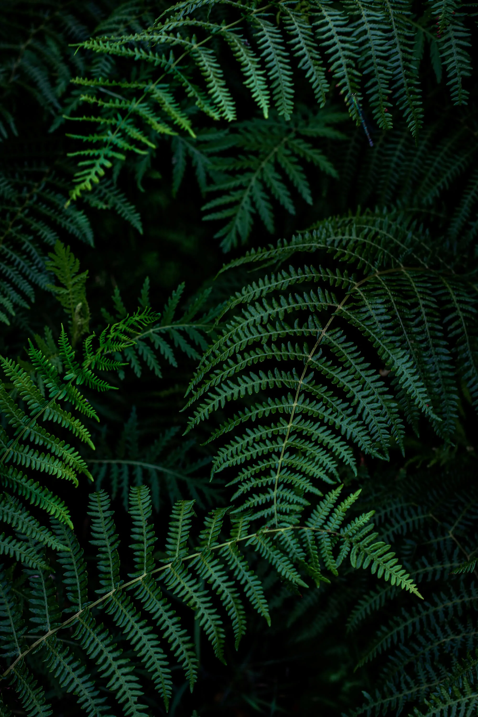
Rozpuszczalnia is a workshop retreat center located on the edge of the Białowieża Forest in Poland, created as a space for deep bodywork and mindfulness practice.
connection with nature, balance, harmony, comfort, wellbeing, movement, energy work, calmness, mindfulness, folklore, forest wilderness
More than anything else, it is what determines whether
a service-based space earns a community of loyal returning guests. The owners of Rozpuszczalnia made sure its atmosphere would feel truly unique. My role was to translate that essence into a symbolic visual language - creating the identity of a place where you want to pause, rest, let go of control, dissolve tension, wander deep into the forest - and into yourself.

for the development of body and mind, where you can leave everyday stress behind, immerse yourself in the energy of the ancient forest, and reconnect with a sense
of peace and harmony within yourself.
Rozpuszczalnia’s colour palette is rooted in forest-inspired tones that soothe the senses and create a feeling of closeness to nature. Muted greens evoke calmness, restoration, and grounding. These are colours that invite you to slow down, soften, and let go.


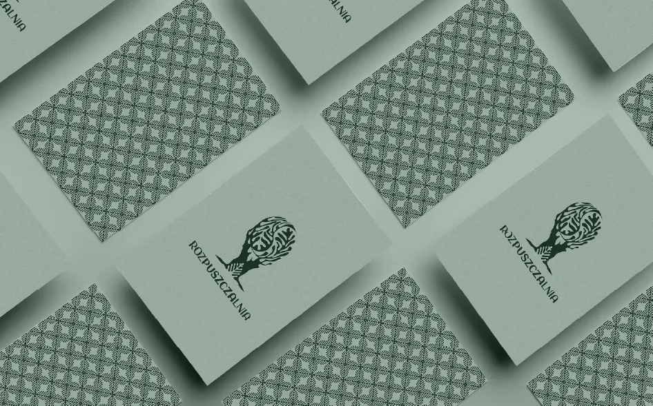
The emblem combines the yin-yang symbol - representing balance and harmony - with a tree trunk that references life, growth, and the surrounding forest. Notice how the leaves seem to dissolve into one another in an embracing flow. Carved into the trunk is a folkloric motif that appears throughout the visual identity, highlighting the brand’s connection to the traditions and cultural heritage of the Podlasie region.
For the headline typeface, I chose the distinctive Google Fonts font Aclonica, which gives the identity both expressiveness and a sense of lightness. It is complemented by the clean and highly readable Nunito Sans, used for longer text passages, and the delicate handwritten Moontime script, applied selectively to add a more personal and subtle touch.

The brand pattern is a tribute to the rich folklore of the Podlasie region. Although built from a simple element, it forms an intricate mosaic full of depth and rhythm.

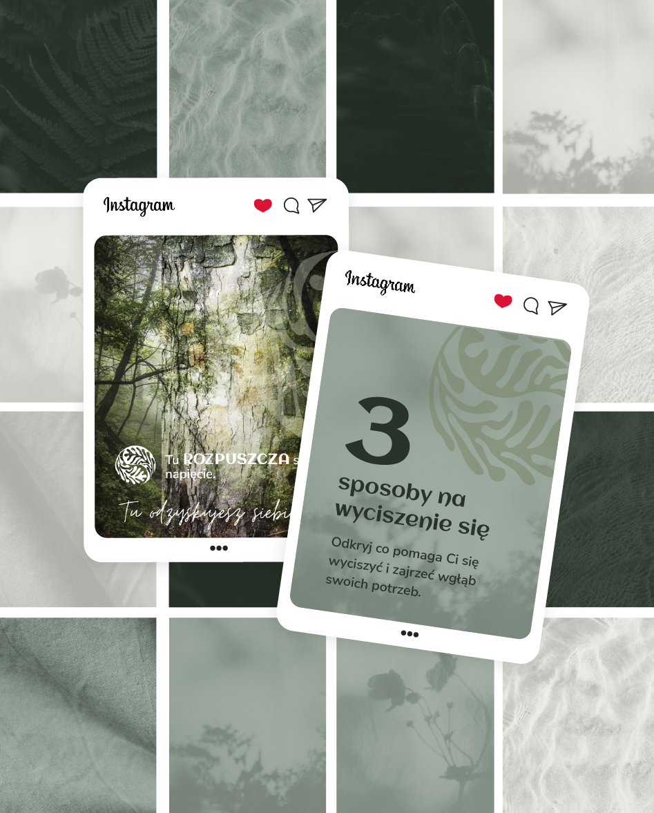
To make content creation for Facebook and Instagram easier, I designed a complete set of visual assets that build a cohesive and atmospheric brand presence, including:
- Instagram story highlight icons
- Custom illustrations
- Backgrounds for posts and stories
- Facebook cover image
- Instagram grid layout concept
- A set of ready-to-publish pinned carousel posts
presenting the most important information
- Editable post templates designed in Canva.


Bardzo długo szukałam odpowiedniej osoby do wykonania mojego logo i identyfikacji wizualnej. Przypadkowo na FB trafiłam na Agatę i zakochałam się w jej projektach. Jeśli szukacie utalentowanej i kreatywnej osoby do stworzenia Waszego projektu to zdecydowanie polecam Agatę.
Don’t wait - start building your brand today. Together, we’ll create a cohesive and distinctive visual identity that truly reflects the unique character of your space. With a thoughtfully designed branding system, growing your business - whether you’re launching a new place, refreshing your image, or attracting new clients - becomes more intentional, consistent, and effective.
Get a custom quoteCheck out my branding pricing


